Art Theory
Color Psychology in Contemporary Art
April 10, 2023 · 9 min read

Color is often the first thing a viewer feels before they fully register form, subject, or technique. In contemporary art, that first emotional signal matters. It shapes whether a painting feels calm, tense, intimate, expansive, or unresolved within a few seconds of viewing.
I think about color psychology as a practical studio tool rather than a rigid theory. Certain hues tend to carry familiar associations, but context changes everything. A deep blue can feel meditative in one composition and distant in another. A warm red can read as vitality or pressure depending on surrounding values.
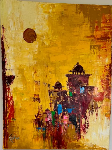
My process usually starts with one dominant emotional hue that acts as the anchor for the painting. From there, I build a supporting palette that either stabilizes or challenges that anchor. This keeps the composition focused while still leaving room for complexity and surprise.
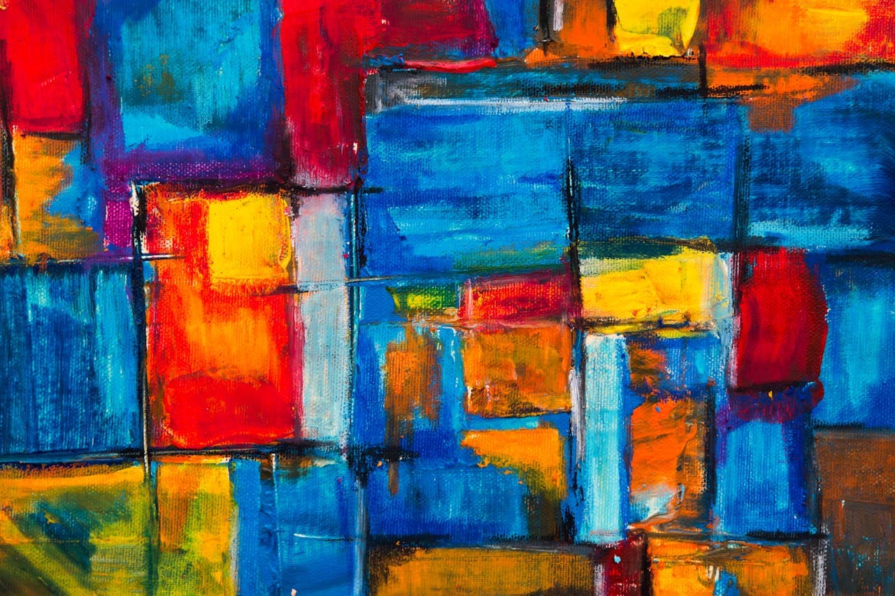
Temperature contrast is one of the most effective ways to direct attention. A controlled shift between warm and cool passages can create depth without relying on literal perspective. It also helps me shape pacing, so the eye moves through the painting with intention rather than drifting randomly.
Value is just as important as hue. Two colors with similar value can produce a quiet, atmospheric field, while strong value contrast creates urgency and focal pull. When a painting feels visually noisy, the issue is often value structure, not color choice. Solving value relationships usually restores clarity.
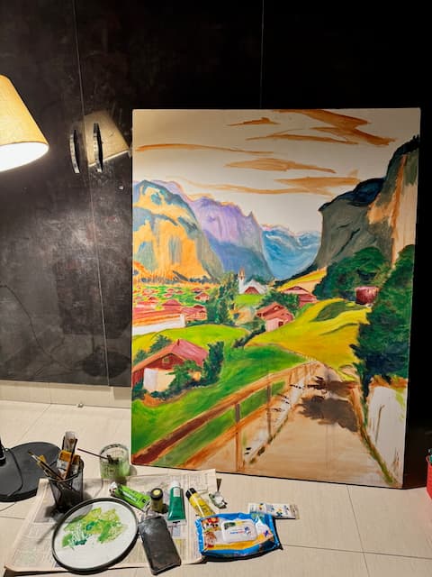
I also test color decisions in real lighting conditions because paintings are experienced in homes, galleries, and studios with different natural and artificial light. A palette that feels balanced in the studio can become too flat or too aggressive elsewhere. Reviewing under multiple conditions protects the final result.
In abstract and semi-abstract work, color carries narrative weight. Without a literal storyline, color relationships become the story. They suggest movement, tension, pause, and resolution. This is why I avoid choosing colors only because they are trending. The palette has to serve the emotional logic of the piece.
For collectors and designers, understanding color psychology helps with placement as well as selection. Art does not live in isolation. It lives with architecture, textiles, furniture, and daily routine. The right painting can unify a room not only visually, but emotionally.
For painters, the most useful approach is experimentation with intent. Study theory, test combinations, and document what different palettes communicate in your own work. Over time, you build a personal color language. That language is one of the clearest signatures of a mature contemporary art practice.